Thursday, May 11, 2017

Exercise 10: Using Survey Grade GPS and other Survey Equipment

Introduction
This exercise provided the opportunity to conduct a survey using a variety of survey equipment. Some of the equipment used included: survey-grade GPS receiver, TDR probe to measure moisture in the soil, soil thermometers, and soil pH monitors. The opportunity to see a drone fly by using a grid mission was part of the exercise to collect imagery of the study area.

Study Area
The study area is located within the City of Eau Claire (Figure 1). The study area is next to South Middle School. It is a garden that is next to a couple retention ponds.
Figure 1. Study Area located at 44°46'42.6"N 91°28'22.8"W.


Methods
By using different equipment, steps were taken to survey the garden that was located in the study area. Points that were surveyed were first identified by using an orange flag. The flags were placed around the garden in a grid formation. The different tools were then used to test the soil where the flags were placed. The pH and temperature of the soil were first tested using the soil thermometer and soil pH monitors (Figure 2).
Figure 2. An example of one of the tools used to survey, pH monitor. 
Next the Time-Domain Reflectometry (TDR) probe was used to measure the moisture in the ground (Figure 3). Various points were taken around the flag and then averaged to get the average soil moisture content around the point.
Figure 3. Example of the TDR probe used to test the soil moisture.
The survey-grade GPS station is located directly on top of the designated point (Figure 4). It marks the location of the point in an accurate manner by averaging the 30 locations that were taken. The data collected for the pH, soil temperature, and soil moisture can be added to the receiver to keep the data all together with the specific location. In case of error, the data was still all collected manually in a notebook.
Figure 4. Survey-grade GPS station in the process of gathering and inputting location data and other attributes.
To capture the aerial image, the DJI M600 unmanned aerial platform was flown over the study area (Figure 5). The imagery that was used was collected from the DJI Phantom 3 Advanced and the images were processed in Pix4D Mapper. Ground control points were used to connect the overlapping images together. This creates a high resolution image of wehre the points were collected with the GPS receiver.
Figure 5. Aerial View of the Garden at 70 meters using the DJI Phantom 3 Advanced.


Results

Figure 6. Map of the variation in soil moisture. 
The soil moisture varies throughout the garden, with the middle areas of the garden consisting of a higher moisture content (Figure 6). The moisture content was also higher because it had just previously rained before the survey was done.
Figure 7. pH level of the soil based on acidity. 
 The acidity of the soil was higher in the lower right area of the garden (Figure 7). This created a great change across the plain of the community garden. Certain factors of that one plot could cause a change in the pH, such as the techniques used to garden.
Figure 8. Soil temperature measured in Degrees Celsius.
The temperature of the soil in the community garden was for the most part consistent. The temperatures on the right side (lower right specifically) shows variation in having lower temperatures (Figure 8).


Conclusion
After having the opportunity to use various survey equipment, there is many effective ways to collect data. By having many different surveying techniques, it makes it more beneficial in data collection to fully understand nature of the study area. By using multiple attributes, many different conclusion can be made about the study area.

Monday, April 24, 2017

Exercise 9: ArcCollector

Introduction:
The question posed for this study was "how many coffee shops are located in each of the defined neighborhoods for Eau Claire?" This question will provide data of how many coffee shops are located in neighborhoods that are in student population for UWEC. It will also show the proximity of coffee shops that are close to campus for alternative places to study and also provide the resource fro readily available caffeinated drinks.

Study Area:
The study area for this study is in the City of Eau Claire. Neighborhoods were defined using Realty definitions and defined areas from the City of Eau Claire. Coffee Shops were only mapped within the city limits, since this is where UW-Eau Claire is also located. The center of the study was defined as 105 Garfield Ave. This location is in the heart of campus and is specifically the address to the library.

Methods:
The data needed to be prepared in ArcGIS Desktop before being able to use the web app of ArcCollector. First a geodatabase needed to be started. In this case, it was called EauClaire_Coffee_Shops. The domains for the geodatabase needed to be established. Domains are rules that describe the values of a field type, enforcing data integrity. Domains included Food, Neighborhoods, Coffee, Type. Coded values were added to those that could be answered without having significant or diverse values. Table 1 shows the attribute table with the data filled in after the data collection was complete. 
Table 1. The attribute table of the Coffee_Shop_Locations after the data was collected.
After the domains and fields were established with its proper type, the geodatabase needed to be published. Using ArcGIS online, a new map was created. The street basemap was selected and the layer was added to the map. Once the map was saved, it could be used in ArcCollector.

The data was collected by driving around the study area and taking points at the front door of every coffee shop. The attributes were filed out for each feature class. Figure 1 is an example of what ArcCollector looks like on a phone.
Figure 1. Screenshot of ArcCollector on a phone.
After the points were all collected, the map could be downloaded so it could be manipulated in ArcMap.

Results/Discussion:
Figures 2 and 3 show the location of the coffee shops around Eau Claire. Each shop was within a 6 mile radius of the central point at 105 Garfield Ave.
Figure 2. Locations of the coffee shops around the study area of the City of Eau Claire.
Figure 3 looks specifically at where the coffee shops are located in respect to the neighborhoods. Typically UWEC students live in Randall Park as well as the Third Ward. Part of Downtown Eau Claire also lies within the Third Ward. Three of the 18 coffee shops are in Randall Park and four are located in the Third Ward. These two neighborhoods have the most coffee shops within them. The market for students is more likely to be reached in these areas anyway.
Figure 3. Locations of the coffee shops within the defined neighborhoods.
Other factors that students could make when deciding on which coffee shop to stop at were mapped. The first one being the distance coffee shops are from campus. Figure 4 consists of a 3 ring buffer at 1 mile each. Many students do not have a car, so the shops that are closer in proximity are going to be greater target. Two of the coffee shops are located on campus, but their hours vary and they are typically not open on the weeks.
Figure 4. Distance of coffee shops from campus.
Another factor that some consider is the type of coffee sold (Figure 5). Some people are interested in where their coffee is coming from. Six of the coffee shops provide Fair Trade coffee, specifically Caribou Coffee. For those that are looking to be environmentally friendly as well, one shop (ECDC) sells organic carbon negative coffee.
Figure 5. Coffee shops defined by the types of coffee they buy.
The last factor that was considered was deciphering is a coffee shop was part of a chain or local (Figure 6). Seven of the 18 shops are part of of a chain (Starbucks, Caribou), leaving the remaining 11 as local assets to Eau Claire (Racy's, Acoustic).
Figure 6. Defining if the coffee shop is local or a chain.

Conclusions
The proper project design is essential when collecting data in the field. Feature classes, domains, and fields need to be established before data collection. Once you are in the field, there is so way to go back and change or add things. One thing that I forgot to add was a notes section. This is an essential field when data collecting. Significant feature can be noted or new feature ideas that could be added later can be typed up in the notes. After driving around the entirety of the City of Eau Claire, an analysis on the types of areas that these shops were located could be used for future expansion. This project could be taken to the extent of trying to do site selection based on drive/walk times, customers, competition, and markets. 

Thursday, March 30, 2017

Exercise 8: Arc Collector: An Introduction to gathering geospatial data on a mobile device

Introduction:
Smart phones and tablets have been created to have more powerful computing power than most GPS units. For more efficient data collection, gathering geospatial data on mobile devices is becoming a popular phenomenon. Smart phones have the capability to access online data that allows for data to be updated as the data collection goes on. This project will introduce the data collection method using mobile devices and setting up a project for data collection. 240 data points were collected around the University's campus using Arc Collector. The data could then be accessed in real time, while others were creating the data at the same time.

Study Area:
The University of Wisconsin-Eau Claire's campus was divided into 7 zones (Figure 1). The class was spit into 7 groups, with two people collecting data in the zones. Zone 7 was the zone that I accessed. This included areas such as Davies, Schofield, and the Library.
Figure 1. Base Map of the Study Area divided by the 7 zones.

Methods: 
The first part to the lab was downloading ArcCollector on everyone's mobile devices. This allowed for us to create a group (Geog337Spring17_Micro), so we could all access the interactive map while the class collected data points. ArcGIS Online provides the opportunity to access software online and one mobile devices. The attribute data that was going to be used in the field was gone over before we collected in the field. The attributes consisted of Temperature, Dew Point, and Wind Chill expressed in Fahrenheit, Wind Speed, Wind Direction (in Degrees) and Time (Military Time). A sample of the attribute table can be seen in Table 1. 
Table 1. Attribute table of the first 40 data points collected on Arc Collector and placed in ArcMap. 
Once the data collection process started, each group of two collected 20 data points allowing for 40 points per zone. Using the Kestrel Thermometer, the temperature and wind data was shown and then added into the ArcCollector Attributes. Figure 2 shows all the data collected around campus. Using the group feature on ArcGIS Online, all the data from each colleague was complied into one dataset. 
Figure 2. Data point locations that were placed on the study area of campus.

In MapViewer, an online program through ArcGIS online that allows for public sharing of maps online, the data could be presented in a series of ways such as the Heat Map based on the Temperature data (Figure 3).
Figure 3. Heat Map in Map Viewer (ArcGIS Online feature). 
By saving the data into ArcMap and creating a new geodatabase with the Micro Climate points embedded in it, a series of maps could be created that represent various attributes in the data. The spline interpolation method created a 2D surface with graduated colors that represented temperature change (Figure 4).
Figure 4. Temperature Map created using the Spline tool and Data points. 
Figure 5 is another example of a map created using another attribute field in the data collected with ArcCollector. Using a different interpolation method (IDW), the color map was implemented based on the Dew Points taken at each location. The due points tended to be higher in Zones 6 and 7, which would be in the heart of campus where majority of the academic buildings are located.
Figure 5. Dew Point of Study area using the IDW interpolation method.
Another feature was also included in the data collection. To get a greater sense of the wind speed, the graduated symbols show the different areas where it tended to be windier than other. The larger symbols tend to be in Zones 1 and 2 on the north side of the river. However, there is still plenty of variation in the wind speeds across the campus.
Figure 6. Graduated Symbol map of the wind speed of the study area.

Results/Discussion:
Establishing the attribute fields is an important part of data collection. Certain features needed to be added in order to properly enter the data. For example, allowing for letters to be used when typing in notes, or special characters being added to the numerical sections. The numerical values of the temperatures only allowed for whole numbers to be placed into the attributes. By having decimal places added, the data could have added more accurate and significant values to the final product of the micro climate. Another important piece to consider when looking at the data is that different interpretations or error in devices among people could influence the outcome of the data.

Conclusion: 
This lab provided the knowledge and experience to using another tool for data collection. By being able to establish attribute fields on a mobile device, the notion of writing does not have to be done if the data can be collected electronically and saved online on the fly. By being able to manually enter the data in on Arc Collector, other tools can be used to gather the data and solve geospatial questions. This lab provided the insight and introduction to do further labs that use Arc Collector to solve spatial problems. 

Monday, March 27, 2017

Exercise 7: Conducting a Distance Azimuth Survey

Introduction: 
The purpose of this lab was to create a grid based coordinate system. While this method is not the ideal way to collect points, the tools and techniques learned in this lab prepare us for times in the field when certain technology fails.This sampling method relates to other methods including the point-quarter method and mapping out linear features on the landscape.  The survey will use distance and azimuth. Azimuth is the direction of an object from a particular point, expressed by angular distance. Three different stations were selected. Standing in one central location, different distances of trees, diameters, and azimuths were surveyed.

Study Area
For this lab, the class was divided into three groups and headed to Putnam Drive/Park on the UW-Eau Claire Campus. This specific area includes a dirt path that goes through a wooded area. As seen in Figure 1, the green path represents the dirt path that is Putnam Drive. The north side of the path is a floodplain that also has a creek flowing through it. It contain many trees in the saturated ground. The south side of the trail has a large gradient slope that also contains many trees.
Figure 1. Putnam Drive/Park Study area in relation to the three stations located on UW-Eau Claire's campus.

Methods: 
After selecting the central point to record data, the Latitude and Longitude coordinates were recorded using the Bad Elf GNSS Surveyor (Figure 2). These coordinates were later converted to decimal degrees for data normalization purposes. From this point of origin, 10 different trees were selected.
Figure 2. Bad Elf GNSS Surveyor used for detecting Lat and Long coordinates.
The distance was measured in meters from the point of origin. The distance was recorded using three different techniques: The TruPulse, a tape measure, and the Sonin Combo Pro (Figure 3). From there the diameter (meters) of one of the selected trees was measured using a smaller tape measure.
Figure 3. Image on the left: TruPulse, Middle Image: Sonin Combo Pro, Right Image: colleague using a tape measure to measure the distance from the point of origin to the tree.
The TruPulse can also detect the Azimuth (degrees) as well as the Suunto that specifically looks at the angle using North and South (Figure 4). The TruPulse shoots a laser at the target to show the distance and azimuth from where one is standing. As shown in Figure 5, at one point the distance was measured as well as the azimuth.
Figure 4. Suunto used as a way to calculate Azimuth to detect the degree to which the tree is located from the point of origin.
10 different trees were surveyed at each of the three stations and recorded like the table in Table 1. When the tape measure was used to record the distance, the point of origin had to be more in the floodplain of Putnam Park. This way more trees were surrounding the area and were accessible to measure.
Figure 5. Colleagues and I recording, measuring, and detecting the azimuth.

Using the recorded data from Table 1 in ArcMap, the data needed to be altered. Using the tool in the ArcToolbox Bearing Distance to Line, the distance from the point of origin to to the selected tree was shown. To create points from the trees the tool Feature Vertices to Point created the points of the trees at each station as well as the point of origin, Shown in Figure ?.

Table 1. Complete results of the recorded data surveyed at the three stations.
After the tools were used to created the two feature classes in the geodatabase, results like the ones in Figure 6 were created. 

Figure 6. Bearing Lines and Points created using the tools in ArcGIS to conduct and azimuth survey.

Results: 
By overlaying the points on a basemap (Figure 7), it appeared that there was some variation in the stations. Stations 2 and 3 seem relatively accurate because the points are off the path of Putnam Drive, considering the points of origin were off the path as well. The first station raises question due to the fact it seems a tree point is on top of the hill. But that could also be due to the fact that elevation is not shown in this figure. There is a path that crosses over Putnam Drive where the first station on the left was recorded. There must have been error in the coordinates because the azimuth for station one is farther to the left than it should be.
Figure 7. Azimuth map of the trees surveryed in Putnam Park.
After joining the points to the table, the diameter could be shown using graduated symbols. By looking at the diameters, it showed the variation of the sizes in the trees that were surveyed. The goal was to find accessible trees that were larger in diameter.
Figure 8. A map demonstrating only the variations in diameters among the trees that were surveyed. 

Conclusions: 
The grid based coordinate system is a great technique to learn when technology fails or a back up plan is needed like when a GPS is not available. However, this method is not the most practical way to collect points. That was shown in one of the stations that was not located in the correct spot, showing that the accuracy of the data was off. Knowing the exact point of origin and it's coordinates is key to using the distance azimuth survey method.

Sunday, March 12, 2017

Exercise 6: Construction of a point cloud data set, true orthomosaic, and digital surface model using Pix4D software


Introduction
Pix4D is a photogrammetry software that uses images to generate point clouds, digital surface and terrain models, orthomosaics, textured models, etc. It can generate 2D and 3D information strictly from images. This software is for professional drone-based mapping. In this lab, the Pix4D software will be used to assess the areal images from the drone, Phantom 3, of the Litchfield Mine. The images will be provided and the data collection was not done by the class itself. By using the software, the understanding of image quality will be strengthened for future uses with Pix4D and drone use. 

Methods
Before starting the project, a series of images needed to be created that overlap in order to process the imagery. The overlaps depends on the type of terrain that is mapped. This also determines the rate at which the images have to be taken. The recommended overlap is at least 75% frontal overlap and 60% side overlap, shown in Figure 1. The camera should be maintained at a constant height over the terrain as much as possible to ensure the desired GSD.  

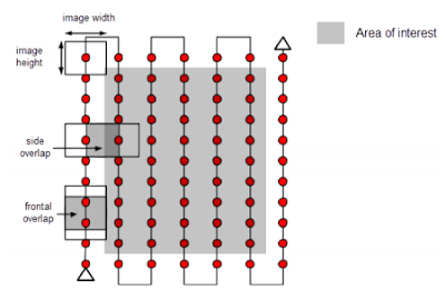
Figure 1: Ideal Image Acquisition Plan.
 For particular terrains persuasions need to be taken. For example, snow and sand have little visual content due to large uniform areas. At least 85% frontal overlap and a minimum of 70% side overlap. 
Rapid checks of the resolution can be done. However, it reduces the resolution of the original images. It, then, lowers the accuracy and may lead to incomplete results. Fewer keypoints are extracted on each image and which makes the amount of matched points between the images lower. If the rapid check processing succeeds, it is safe to assume that the results of full processing will be of high quality. However, if it fails, it means that the dataset is difficult and requires more overlap. It would be a good idea to collect more images if this happens. This can be done by either flying the drone again and combining projects or changing the plan to get more overlap. Since Pix4D can process multiple flights, it allows for multiple cameras as well. It matches the images from one flight with the ones from other flight using the time information when having multiple flights without geolocation using the same flight plan over the same area, and having different camera models for each flight. Oblique images can also be take to process the terrain imagery. Figure 2 show how images are taken with a camera axis not perpendicular to the ground. 

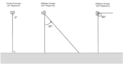
Figure 2: Oblique image angles for drone image capturing.

It also highly recommended to have Ground Control Points (GCP). They are points of known coordinates in the are of interest. These coordinates are measured with traditional surveying methods or other sources like LiDAR. GCP's are the absolute accuracy of the project. This allows for the project to be located in the exact points of the earth. A minimum of 3 GCPs is required for the reconstuction process linked to at least 2 images, 5 to 10 for large projects. They should also be placed evenly on the landscape to eliminate some of the error in scale and orientation. The are also more resourceful if they are not at the edges of the images but in the middle, because then the points can be used in multiple images. 

Once the images are created, the Pix4D software can create projects to combine the images. The following steps can be taken to create a map of the terrain. 
  1. Create and name a new project. The name should include the data, site, platform/sensor, and altitude.
  2. Add the images to the project. At least 3 images in JPG or TIFF are required. Once the images are added, Pix4D looks at the exif file and notes if the images are geotagged and finds the coordinate system. Most UAS data defaults to WGS 84 decimal degrees. 
  3. In the Edit Camera Model, select edit un ther Camera Model name and change its properties to Linear Rolling Shutter. 
  4. Process only the first step. After the first step is processed a quality report will appear. The quality report will provide information on the quality of the data accuracy and collection. 
  5. If the problems in Step 1 are addressed, continue full processing Steps 2 and 3. Another quality report will appear. 
Discussion
The quality report for the completed processing includes a summary (Figure 3). Under quality check, it shows that 68 out of 68 images were calibrated and enabled. Therefore, none of the images were rejected.

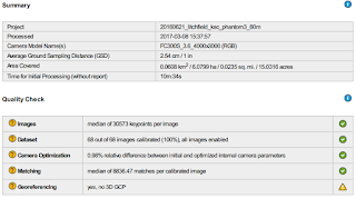
Figure 3: Summary in the Quality Report of the overlap images used to create the Litchfield Mine Terrain. Full Quality Report file:///Q:/StudentCoursework/JHupy/Studentfolders/GEOG.336.001.2175/COONENKA/Lab6/20160621_litchfield_kac_phantom3_60m_report.pdf

The overlap for this activity included 5 images of overlap (Figure 4). The overlap areas that were poor are located on the edges of the image. This could be due to less GCP points or more images in the middle of the field of interest. In the quality check, the georeferencing posed some error/issue in the final report after processing. This is due to the lack of 3D GCP. There was still GCPs provided for the lab. 

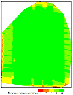
Figure 4: Number of overlapping images computed for each pixel of the orthomosaic. Red and yellow areas indicate low overlap for which poor results may be generated. Green areas indicate an overlap of over 5 images for every pixel. Good quality results will be generated as long as the number of keypoint matches is also sufficient for these areas.

Figure 5 is a mosaic image of the elevation results that were detected from the calibration images and geolocated images. This includes a preview of what was included in the summary and quality check details. 

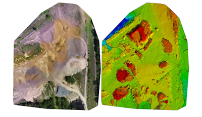
Figure 5: Orthomosaic and the corresponding sparse Digital Surface Model (DSM) before densification.

Once the project is complete, an animation can be created that 'flys' through the project. A 3D images can be moved in different directions to see the different elevations and points on the terrain. Figure 6 is a video of the Litchfield Mine results.

Figure 6: Fly video of the project terrain.

Once the final terrain was created from the combining of all the drone imagery, in ArcMap, the raster image was implaced to show the area of interest in the Litchfield Mine (Figure 7). Using the Phantom 3 Drone, an elevation of 60 meters was obtained above the study area.

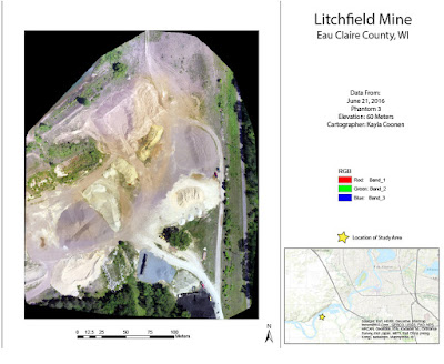
Figure 7: Final product of the data created in Pix4D.

Conclusion
By using Pix4D, another understanding of how to create areal imagery was obtained. In the future, hopefully more feature classes can be created using ArcGIS to further describe the study area. Pix4D allowed for a better understanding of the accuracy of the data. By having the quality report available, it can be shown which areas contain error. Like previously stated, this lab showed error in the Georeferencing. The data of this lab was created from another source, therefor, the error in the GCP was not something that could be controlled. However, it still served as a great example of what issues could arise when the areal images with the drones are collected by the class. By running through the tutorial of how to use Pix4D, it provided information of how to perfect/improve the data collection and what is expected when the chance to survey comes along.

Monday, March 6, 2017

Exercise 5: Using Survey 123 to gather survey data using your smart phone

Create a Survey
Using Survey 123 for ArcGIS, a survey can be created. In this particular tutorial a survey was made to help the homeowner association (HOA) gather data on the community members' and thier preparedness for disasters. Using this site, start by clicking on Create New Survey. Aftering titling and adding details to the survey, then the questions can start. The Add tab allows for common questions to be asked such as the date, single line text, multiple choice questions, and more shown in Figure 1.
Figure 1. Options of possible ways to ask questions in while creating a New Survey.

The single choice allows for options with only one being able to be chosen. Multiple choice acts as a check box, selecting all that apply. Some questions can only be asked if circumstances are set. For example, if yes is selected, then another question can ask such as how many. Nine safety check questions (Figure 2) were created in the survey along with other information about the households.
Figure 2. A few of the Safety Check Question asked on the survey.

A geodata box was also implemented to show the exact spot of the location that was identified. This geodata can then later be used to map the locations of community members that completed the survey and the area that their house is located. When questions are completed and looked over for their correctness, the survey can be published. This survey then can be used on computers, tablets, and phones. The survey will also adjust based on the device used to make it more user friendly.

Complete and Submit the Survey
Download the Survey123 field app. It can be retrieved from iTunes App Store, Google Play, and Windows Store. Once the app is opened and the person is signed in, select the designated survey (HOA Emergency Preparedness Survey). After choosing Collect, the survey can begin. The survey asks for the date, participant location, and asks to locate the residence on the map as well (Figure 3).
Figure 3. A screenshot on the phone app of the first questions asked on the survey, specifically the location ones.
Figure 4, shows a question that asks to check all that apply for the age ranges of people in the households.
Figure 4. A screenshot of the survey on the phone app using a multiple choice question. 
 Figure 5 is an example of a question that was answered yes, so it had a follow up question in Safety Check 8.
Figure 5. A screenshot of the survey on the phone app showing an example of a question that had a follow up question after selecting yes. 
When the survey is completed, the options are to send now, send later, or continue the survey. If it is sent later, it will just be saved in the outbox of the app.
Once members complete the survey, it is saved to see who competed it. Under the MySurvey's tab, the Collaborate and Analyze sections can be used to look over who completed the survey. This is also where it can be decided who gets to see the survey.

Analyze Survey Data
After members have completed the survey, the data can be looked at in a variety of ways. Returning to the website, the Overview will show how many records and participants there are and the data of submission. The Analyze tab has the statistics of each question and how each participant answered them (Figure 6).
Figure 6. A pie chart of the response for the question "What Type of residence do you live in?".
By clicking map, the location of the participants open up in ESRI online. The location points can be representations as simple points or graduated symbols based on the question. Next the data can be downloaded as a CSV, shapefile, or file geodatabase and opened in ArcGIS Map Viewer. The style of the points can be changed to another drawing style like Heat Map in Figure 7.
Figure 7. the Heat Map in the ArcGIS Map Viewer online. 

Share your Survey Data
The Online ArcGIS Map Viewer can be used as an interactive map that allows for the data to show for each location. If a certain point is selected the shareable data will pop up in a window next to it. It will show the answers how the participate answered in that location (Figure 8).
Figure 8. The interactive location in response to submitted surveys and the data that is available if a point is selected.
The map and its data can then be saved and shared as an URL for public access. An app can also be created for another viewing mode. In order to access the online interactive map go to: https://uwec.maps.arcgis.com/apps/View/index.html?appid=550a3434c09448e6ae1c58e136a04872.

Exercise 4: Development of a Field Navigation Map

Introduction
This field activity involves creating a field navigation map, which will be used as a reference later in the semester for the navigation activity. The location of the field activity was the Priory area. Two maps were created using the UTM projection and a geographic coordinate system of decimal degrees. The maps also included other information such as contour intervals and elevation. 

Methods
Using geographic coordinate systems is a crucial part in the cartography process. Without having all of the data in the same coordinate systems, they will not accurate project over the top of the other. A geographic coordinate system is a 3-D spherical surface to define locations on the earth. A point is defined by its latitude and longitude typically expressed in degrees or decimal degrees. The spheriod approximates the shape of the earth, while a datum defines the position of the spheriod relative to the center of the earth. Popular datums that are used in North America are NAD 1927 and NAD 1983. Projected coordinate systems are most popular when projecting a map. They are defined on a flat, 2-D surface (Figure 1). Unlike GCS, there is lengths, angles, areas, and is identified by x,y coordinates.
Figure 1. Examples of different planes that can be used for projected coordinate systems. 
Various data on the Priory was provided in order to create the maps. It included 2-foot contour lines, Navigation boundary, raster data of the site, elevation, and LiDAR data. Once the particular data was placed in the maps, the projections had to be the same across all of the data. These particular maps used NAD83 Wisconsin Transverse Mercator in order to minimize the distortion of the study area. This was a simple choice in the areal image was already in the NAD83 projection. 
To prevent business and congrestion in the map, two were created each showing a different characteristic. Each map included the Navigation boundary on top of the areal image. But the first map included the 2-ft contour lines and the second had an overlay of the elevation for the study area. Each map also included a grid one in decimal degrees of 2.5", and the other in 200 meters. For future Navigation activities, a pace count was calculated and included on the details of the map as well. This particular pace count was 65 steps per 100 meters. A scale bar (meters), information on the coordinate system, and a north arrow was added in order to show the details needed for the map navigation purposes. 

Results/Discussion
The first map included the 2-ft contour lines that were overlaid on the areal image, shown in Figure 2. The navigation area was defined by a red boundary line. The grid of 2.5 seconds (decimal degrees) was also used in this map. If this map was done over again, the contour lines would be at a greater distance of 5 ft. or even 10, so it is not as busy looking. Due to some error in making that possible, the contours stayed at 2-ft. 
Figure 2. Field Navigation Map of the Prior with 2-ft contours and decimal degree grid lines.
The second map was to show the elevation of the Priory study area. The Navigation boundary was still the same. However, the grid size was changed to 200 meters. The scale bar is especially important for the map in Figure 3, because the grid is also in meters. The study area is in a place where elevation is not that high. The minimum elevation in the red zone is 194 meters and a maximum of 424 meters in the green areas. The transparency was altered in order to still be able to see the areal image of the study area.
Figure 3. Field Navigation Map of the Priory including elevation and 200 meter grid lines.
Summary/Conclusion
By including grids at various forms of measurement, the Navigation maps will have alternative ways of identifying points in the study area. The elevation and contour lines will also be useful in getting a feel for the topography of the Priory. Future data that was created directly from the source and not provided, may be easier to manipulate in order to achieve easier reading maps.